Valentine’s day is just around the corner, so I’ve been bombarded with a million gift guides online. Each of them lists a bunch of obscure gadgets and gizmos or generic mass-produced gifts that don’t feel personal, especially if your valentine is also a lover of BMWs. This is why I am such a fan of handmade gifts—each is totally unique. So, every year for Valentine’s Day I create something that highlights my favorite memories of the experiences we’ve had together.This year, I decided I would make a handmade piece of art to hang in our office among the rest of our BMW artwork.
Regular readers may know that I am a bit of a DIY’er. For Christmas, I built him a bench out of E46 seats and pine. I also taught myself how to ride my BMW F650GS during the pandemic, how to shoot and edit video for our rally team, and I learned photography so I could take portraits of my X5 at the Rebelle Rally. Something I have always admired about BMW is their passion for art which has inspired me to be creative with our cars. My favorite artistic medium is photography and lately I have been experimenting with the cyanotype printing process.
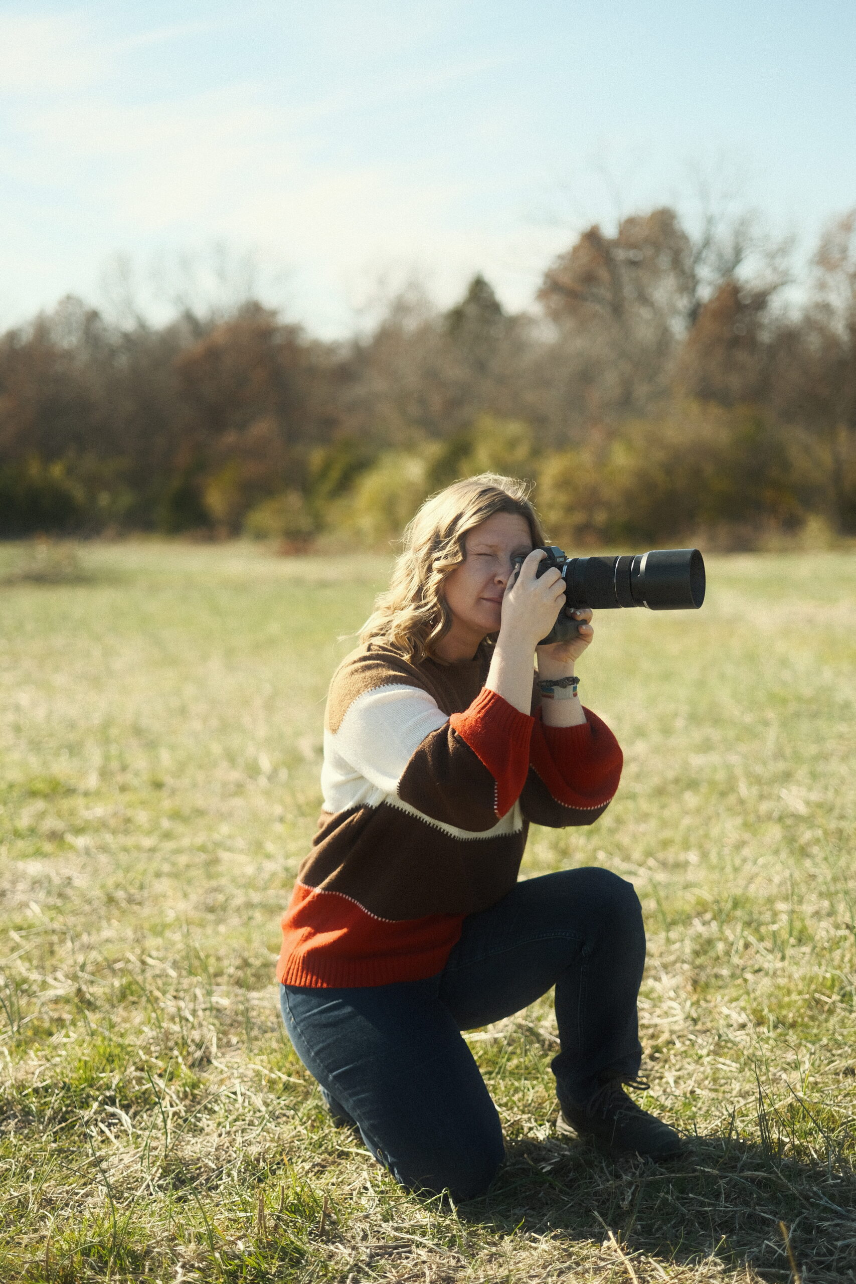
My two favorite places to be are behind the wheel or behind the lens!
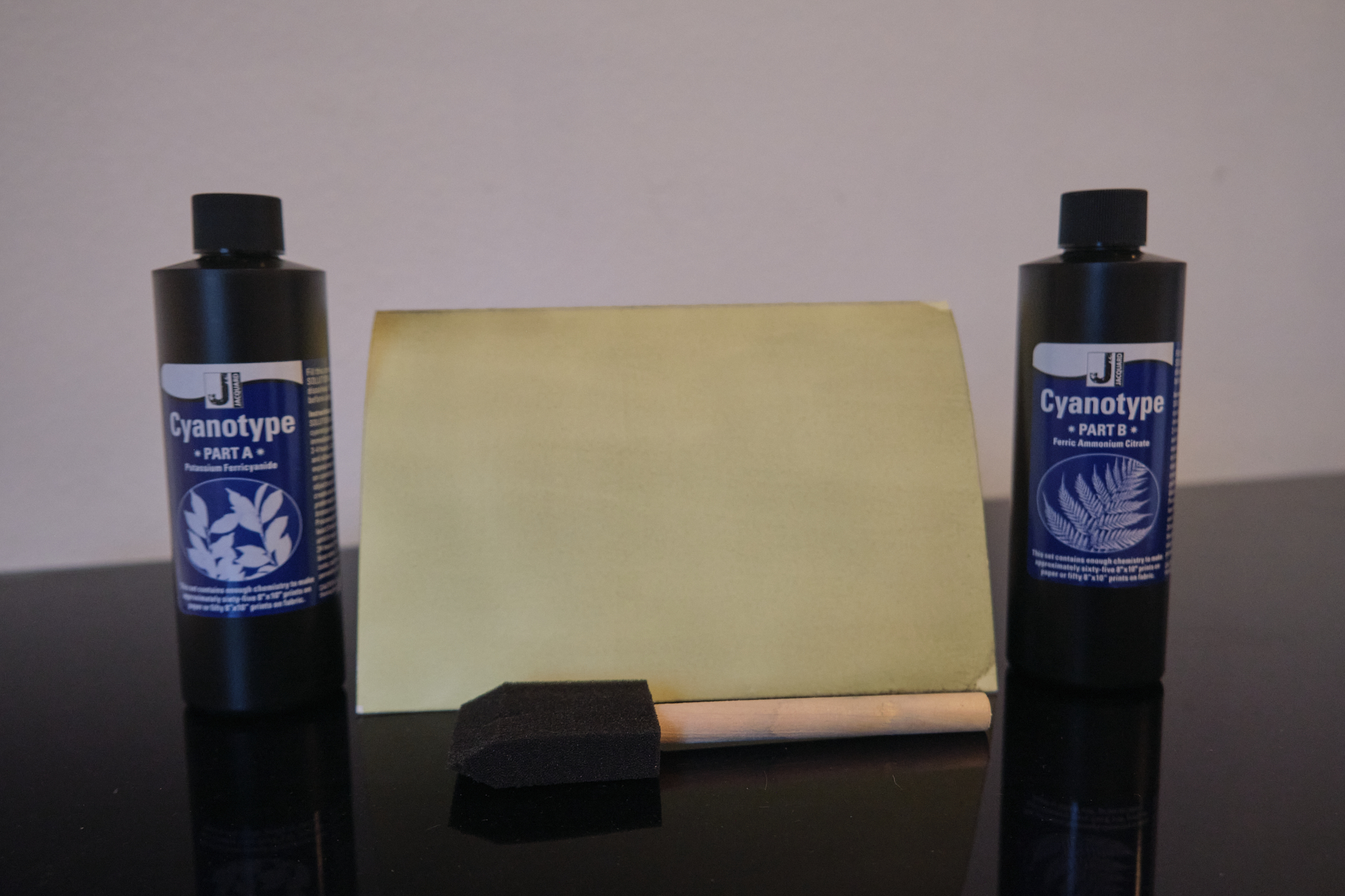
Cyanotype was discovered in 1842 by Sir John Herschel, a Renaissance man of many talents including a love of experimental photography. “Cyan” is Greek for blue and this process was often used to copy technical drawings. These copies were called blueprints and were of archival quality so many of these prints are displayed in museums across the world. I would love to have a peek through the BMW archives to see if cyanotype was ever used by BMW engineers. Enough history—let’s get on with the project!
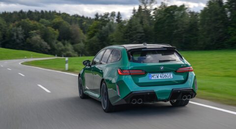
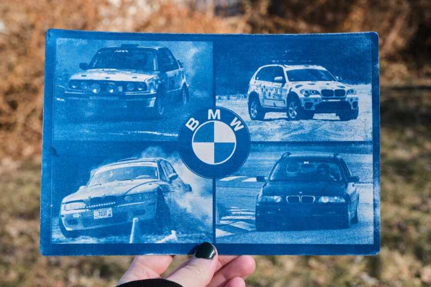
I started by pulling a handful of my favorite photos. I chose a photo of our X5 from the day we spent offroading together, a photo of my E46 touring at the track event that he helped me prepare for, and a photo he took of me rally crossing. I also chose a photo of his rally E30 and placed a BMW logo on the center to pull them together. Each photo will remind us of all the fun we had together in our favorite make. Since photography is also a shared passion of ours, I had plenty of pictures to choose from. Once the collage was made, I turned the image into a negative and printed it on a sheet of transparency.
The two-part solution has been applied and is almost ready for exposure.
The next step was to prepare the two-part solution and brush it onto my paper. As it dries it turns an unappealing greenish yellow color.
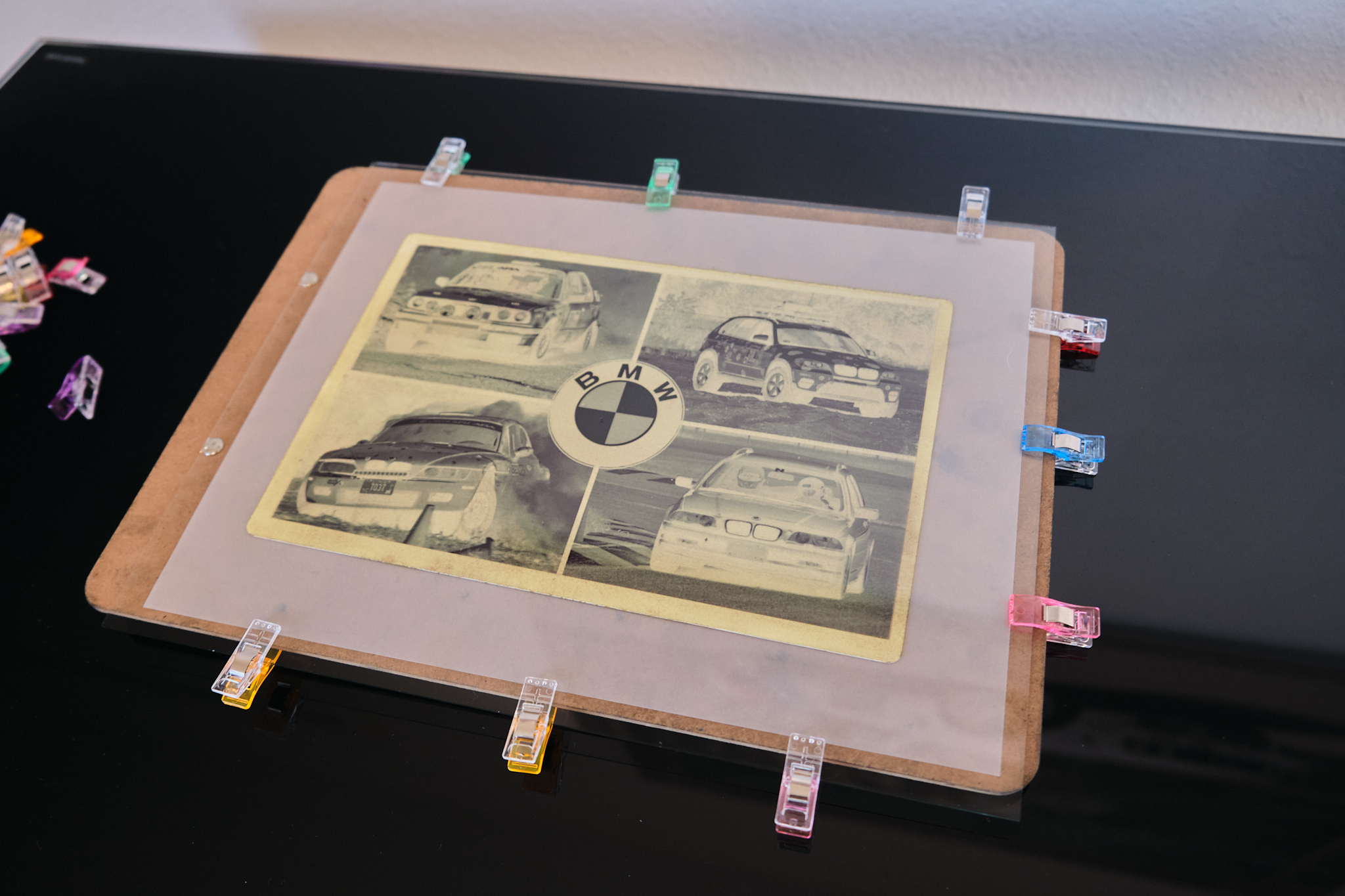
The negative was made by printing onto transparency film with my inkjet printer.
I laid my negative transparency overtop and secured it under a piece of clean glass and clips. This keeps the negative pressed against the paper for the best detail and image clarity. The magic of cyanotype is when it’s exposed to sunlight. This causes a photochemical reaction that turns the solution blue. Since chemistry wasn’t a strong subject for me, I’ll spare us both from a deeper explanation.
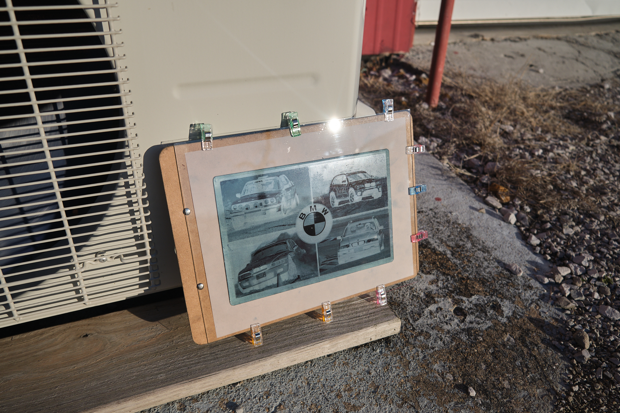
Sunlight is used to expose the image.
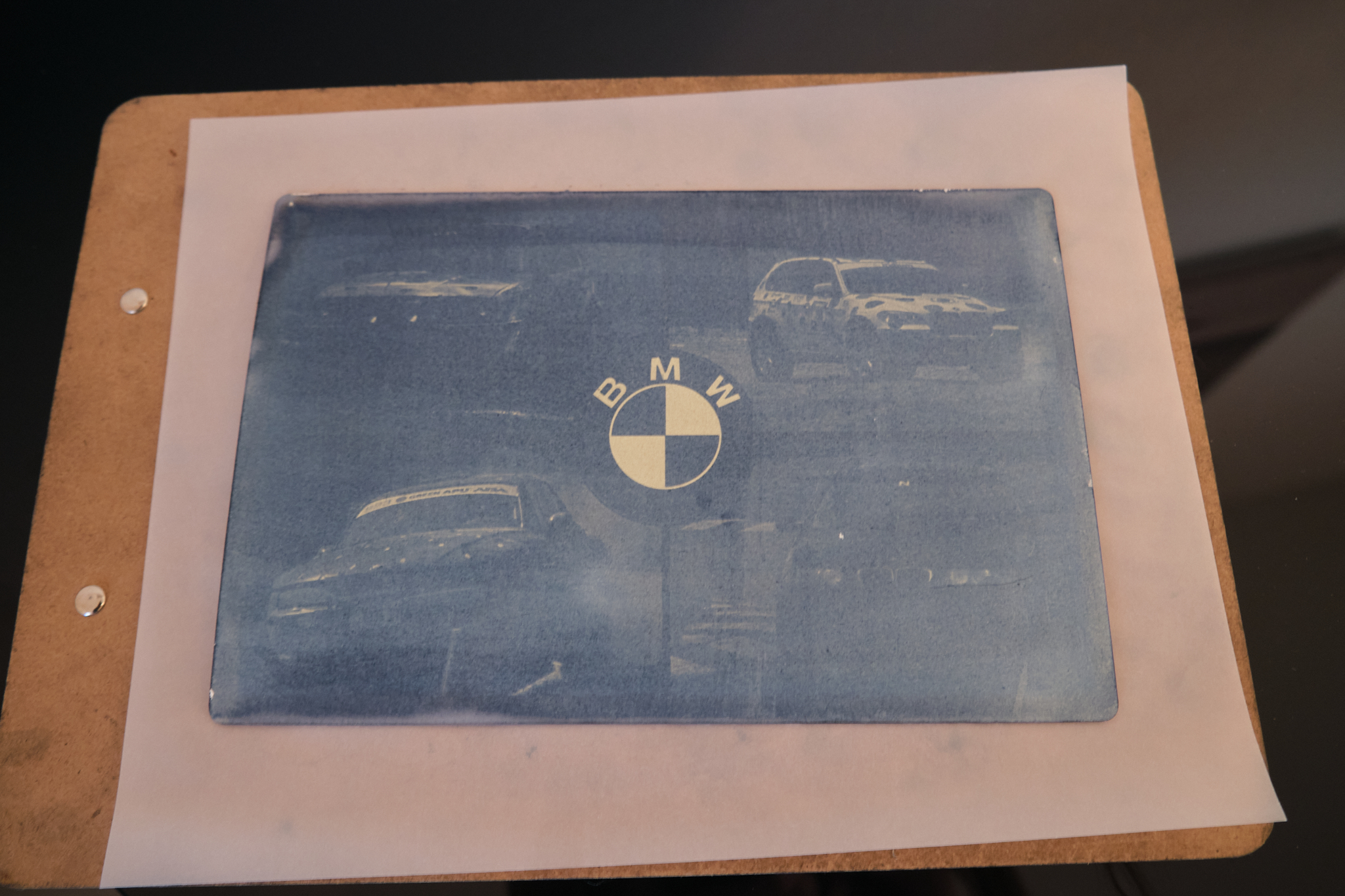
After about ten minutes in the sun, the print is ready to be brought in for development in water. When you first remove the negative the image looks murky and messy. As soon as the paper touches the water, the excess solution washes away and a crisp image suddenly appears (if everything goes to plan). If the image is underexposed, when the paper touches water the beautiful blues will wash away. If overexposed, all the details will be lost in a sea of navy. I always get just a little anxious during this part because this is when you will discover if your exposure time was a success.
Watching the image develop almost instantly in water is my favorite part of the process.
At this point the cyanotype is dried and the product is complete. The shades of blues ranging from LeMans to Avus make the images feel vibrant and exciting. It’s incredible the level of detail that a centuries old process and sunshine can produce. If blue isn’t your color though you can tone a cyanotype using tea or coffee for more of a black and white or sepia effect. I think a toned cyanotype would look amazing with a vintage BMW print.
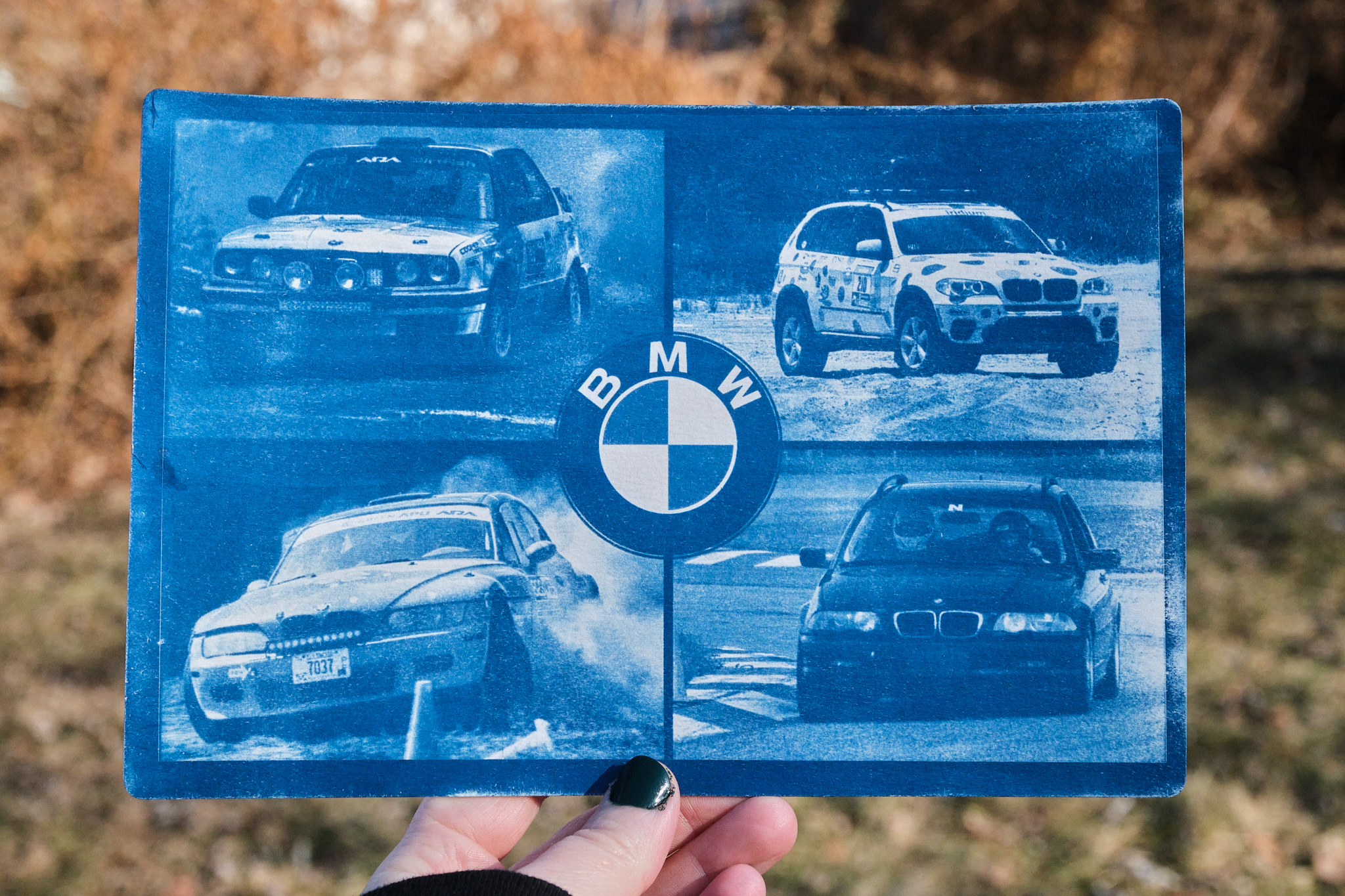
I really love how much character each car has in the collage, the bright color makes them feel lively and exciting.
To really make this gift special and more of a valentine, I decided to add a poem. Since I’m no expert at rhyming verse or much of a romantic I decided to remake the classic “roses are red” with a couple nods to BMW thrown in. I’ll box it up with some of his favorite snacks and his gift will be complete! Now, you can see that this project was truly a labor of love.
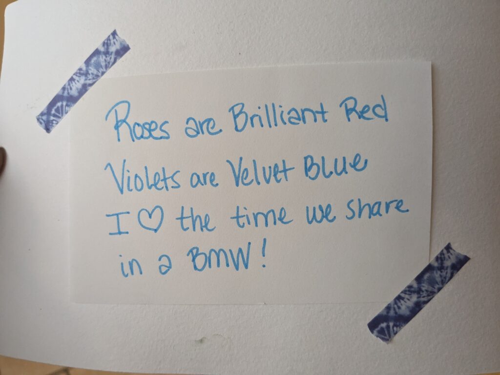
Roses are Brilliant red, Violets are Velvet blue, I love the time we share in a BMW!
If you aren’t an artist yourself, luckily the BMW CCA has you covered! Their store always has a selection of unique BMW artwork and posters. We have numerous posters and banners from the CCA hanging around our shop and home.
Perhaps my next creative endeavor should be a BMW art car?—Kelsey Stephens