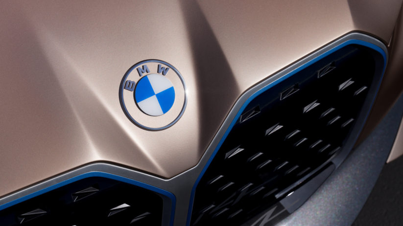
The bright blue-and-white colors of Bavaria have been a fixture on our Bimmers for years—but the roundel that we’ve all come to know and love did not always invoke visions of luxury performance. Initially conceptualized in 1917, the very first BMW logo was in fact a homage to the brand’s aviation roots, and previous cognomen, the Bavarian aircraft engine manufacturer Rapp Motorenwerke.
Although from its conception the Munich-based company was more geared towards the development of engines for automobile, aerospace, and nautical applications, the company focused more heavily on the production and maintenance of aircraft engines for the German Air Force.
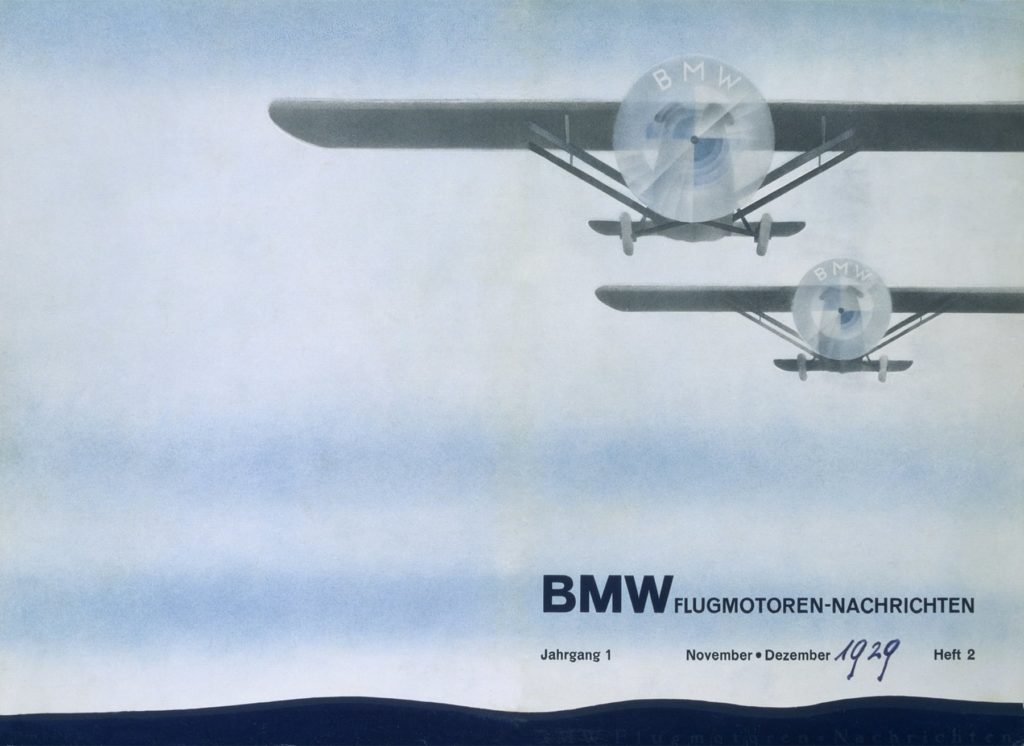
This 1929 print ad led the public to believe that the BMW logo was a propeller meant to symbolize the company’s aviation roots.
When it came time to trademark a company logo for the new name, the old Rapp Motorenwerke logo was seen as a valuable foundation, which subsequently resulted in the new logo bearing a similar round shape and black border. Although it is true that BMW was primarily focused on aviation in its early years, the notion that the quadrants composing the inner circle of the logo represent a spinning propeller are not entirely accurate; BMW claims that that particular notion arose from a 1929 print ad depicting the new logo as the spinning propeller on an airplane against a blue sky—a connection which BMW has neither explicitly confirmed or denied over the past century.
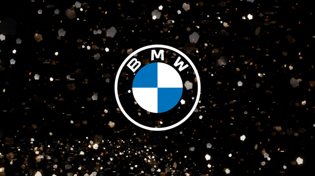
Recently, the new face of BMW was revealed to the public, one which will add to the rich history of the German automaker’s illustrious roundel for years to come. Forgoing the traditional black border and three-dimensional motif, the new logo introduces a transparent interior with a white border and two-dimensional design, parading around a new minimalist visage that BMW’s Customer and Brand Senior Vice President, Jens Thiemer, says “radiates openness and clarity.”
While the traditional colors of the Bavarian flag still adorn the new logo, Thiemer claims that the switch to a more simplified style was the result of today’s consumers’ perception of the brand and the industry. The refreshed design’s transparency is said to be symbolic of BMW’s vision for the future—a new era that not only continues to pioneer electromobility, but also commits itself to keeping a true-to-brand driving experience for enthusiasts.
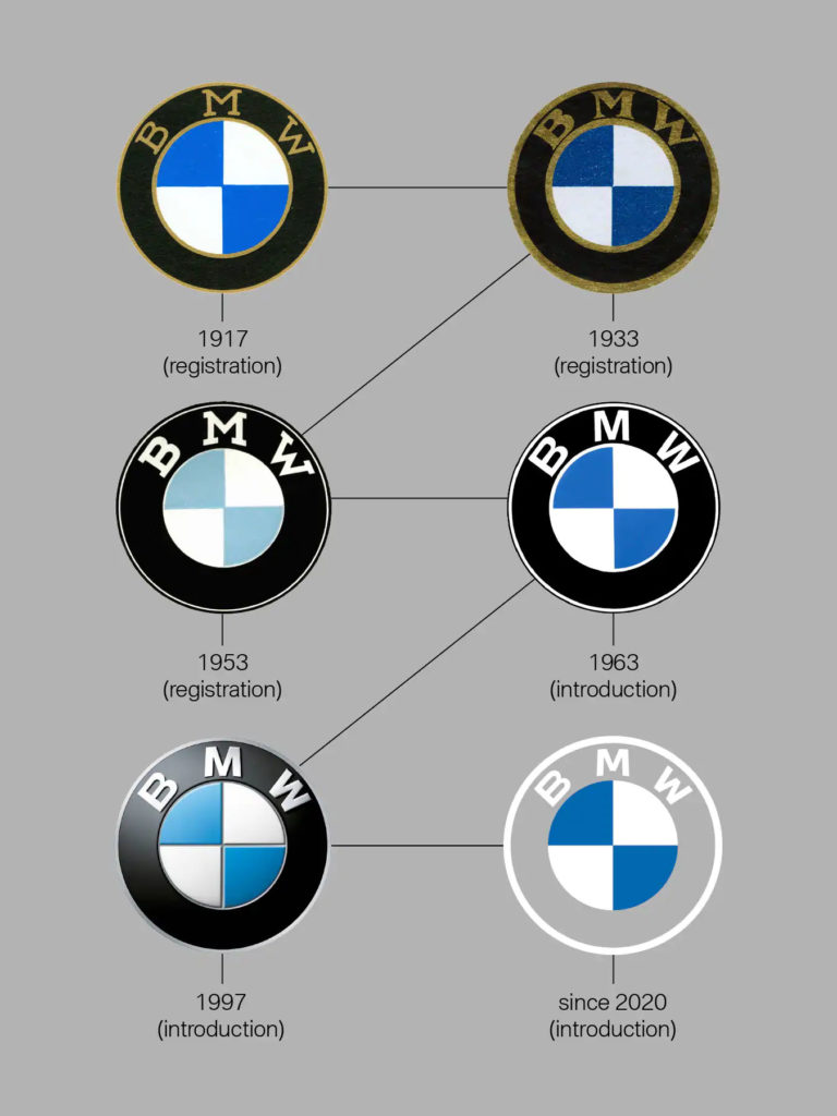
The new emblem made its debut atop the hood of the Concept i4, and subsequently caused quite a stir within the automotive community. It seems, however, that the new design will not be used on any production models—at least for now. Instead, the new logo will be used strictly to represent BMW across all of their digital platforms, including social media. The same also goes for BMW M and BMW i, both of which are now sporting a similar flat 2D design.
The luxury-automaker hopes that through this new re-badged identity and more open communication, it will encourage new digital-age consumers to connect and engage with the brand more, welcoming them into the BMW community as a life-long enthusiast that will be eager explore the brand’s history and future.—Malia Murphy
[Photos Courtesy BMW AG.]

