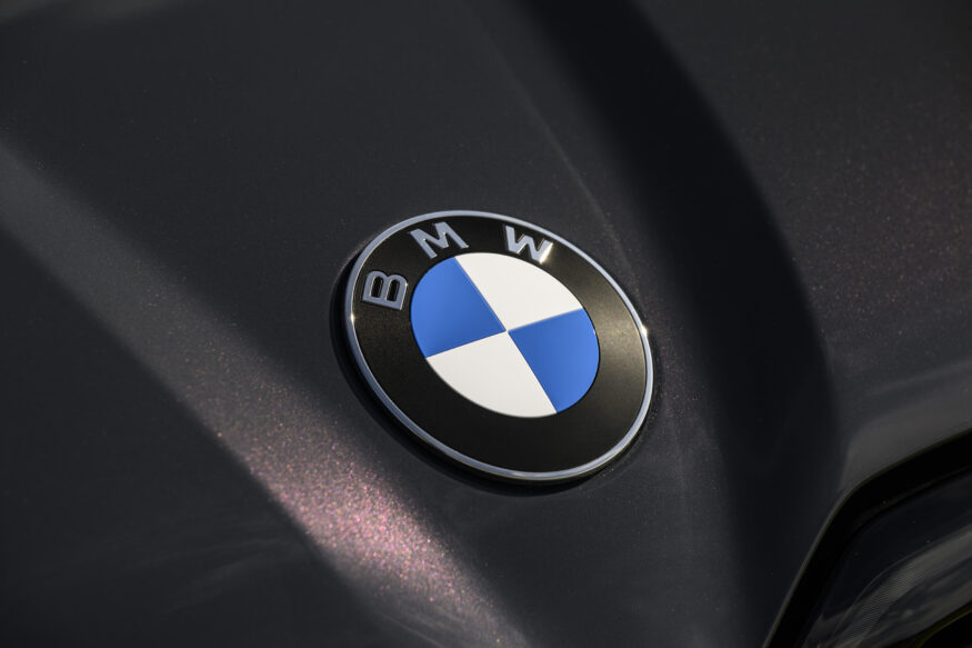
You might have missed it, but the BMW logo got an update for the iX3. Considering that it still looks like the traditional logo at a glance, or even when stared at, you’d be forgiven if you didn’t notice.
But a closer inspection, pointed out by BMW Blog, shows that the logo is now missing the central chrome, with the blue, white, and black now touching. The black ring is also a matte finish, and the BMW font itself seems a bit sharper as well. It’s a subtle change, for sure, but a noticeable one. It also won’t fit current or older models, likely because of how it’s mounted.
Interestingly, BMW Blog also reports that a new M logo is on the way as well. If the change is anything like the roundel, it’ll be subtle.