
Now that Alpina is officially part of BMW, there are more changes incoming for the beloved tuning house and now, brand. First was the January announcement that BMW Alpina will create a line of vehicles meant to emphasize the power and ride comfort Alpina became famous for, and in an even more exclusive and bespoke way than before. Think of it as a range of models that bridge the gap between BMW and Rolls Royce. And now, we have the new logo.
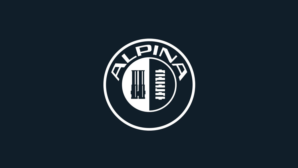
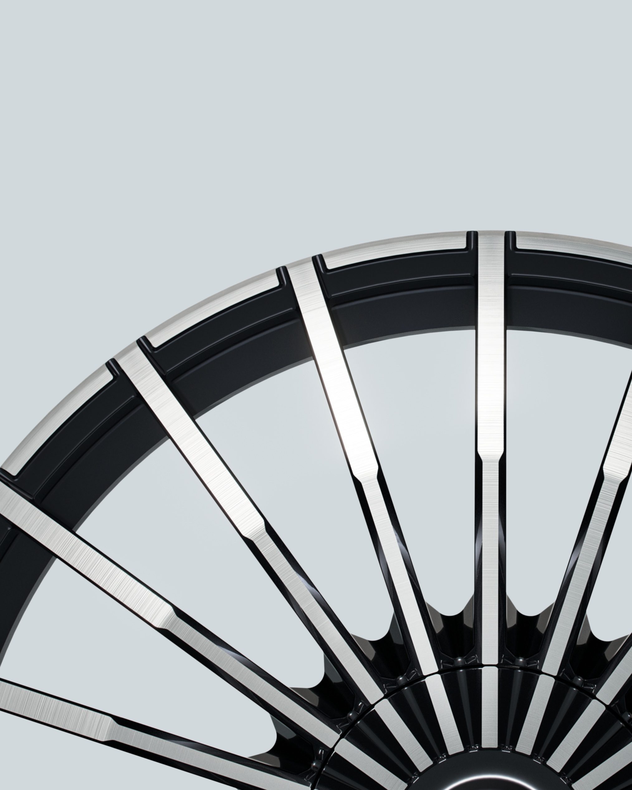
It seems like the logo design folks inside BMW have been busy lately, as we had the refreshed roundel itself just a few days ago, the promise of an updated M logo, and now this, the new Alpina logo. It uses the same wordmark BMW introduced in January and thankfully, the bones of the logo haven’t changed. It’s still a throttle body and crankshaft, as before. It’s been sharpened, much like the roundel was, with what appears to be a deeper attention to detail. It’s also been simplified, with just two colors. Along with small updates to the traditional 20-spoke wheels, it seems much of what BMW is doing with Alpina initially is about evolution.

Of course, the wordmark and logo are minor parts of this new brand. The really important thing will be the cars. BMW says that the new Alpina models will be produced in a select number of factories that have been deemed up to the task of building something this high end and exclusive. The cars will have a high level of personalization options, like colors, materials, and more.
We should hopefully see what the first models from the BMW Alpina brand look like in the near future.