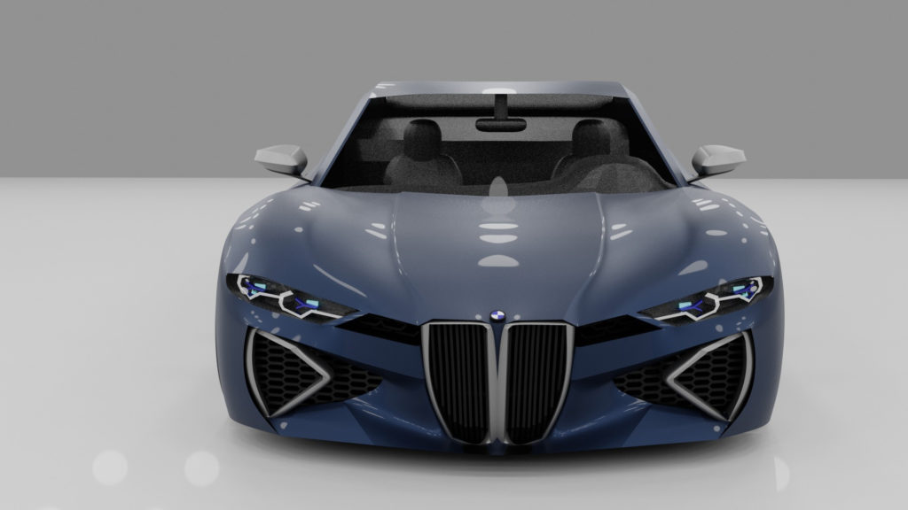
As a member of the BMW CCA for the past 26 years, my passion for BMW has definitely rubbed off on my sons—so much so that my fifteen-year-old son Jack’s career ambition is to become head designer for BMW.
With all of the controversy recently swirling over the huge grilles now being used on many of the new BMW models, and understanding that BMW’s intentions with the new design language is to pay homage to the previous BMW models such as the 3.0CSi, Jack has created his own “proper interpretation” of the vertical-kidney design language. His designs were built using a CAD program called Blender, and were made by him from scratch.—Richard Parry, Rocky Mountain Chapter
Both BMW’s 4 Series and M4 have now been released to the public after much anticipation, and saying that they were met with mixed responses is an understatement. While people are singing the praises of the standard six-speed manual and 473 horsepower on tap, it’s hard to ignore the elephant in the room: the design. While people new to the brand seemed to have taken to the new G22 and G32 face, those loyal to the brand have been left with mouths agape at the new grilles. BMW claims that it’s to make the cars look more bold, to draw back to the company’s roots, to depart from convention, and to improve airflow, but that’s a bit hard to swallow when you look into the swelled nostrils of the new cars to see that about three-fourths of the grille is blocked off.
Now, I found the design of the outgoing F82 absolutely fantastic. However, the idea of returning to the company’s roots of the vertical kidney grille got me thinking: Could I make it work?
In fixing anything, the first step was identifying the problem. As a general rule of thumb when I design any car, the grille should never go above the headlights; it just makes the front look tall, and makes the grille look out of place. The fact that the new face of the G22 breaks this rule, combined with the sheer size of the grille, makes it look far larger than it actually is. The out-of-place theme continues with the rest of the face of the new Four; there is a grille below the massive kidneys that seems to be there only because it was there on the 3 Series.
All of these glitches meant that most of my energy was put into making the front look as good as possible. BMW repeatedly claims that their new 4 Series is supposed to harken back to cars like the E9 3.0 CS and its derivatives, or the prewar BMW 328, so I thought that I would integrate some design elements from those cars. Massaging the grilles to be narrower, making the front slightly more pointed, and angling the grilles downward towards the ground would all give my design the “shark” look of the old cars. Making sure that no front design elements would breach beyond the front of the car would also help in achieving this look.
I also incorporated the vent bar that stretched horizontally across the front of the old cars, with the kidney grilles and headlights completely within it. Ditching the small U-shaped grille under the kidneys of the original Four would also help make the front look wider. Using the original vertical-rib mesh inside the kidney grilles would help define them better; on the real car, the diamond mesh inside the kidney grilles acts like static, causing the eye to dart around, not knowing where to look. The black ribs I used in my design draw the eye to the center of the frames, causing the front of the car to appear more wide and menacing. All of this added together allows for a modern integration of the vertical kidney grille without looking like the car has the nose of a pig.
My goal for the back was to mimic the look of the new car, but with taillights that look distinctly BMW—not like a Lexus IS. For the side of the car, all I had to do was create a strong shoulder line that spanned the length of the car, rather than the new softer look of the real car.
After tackling the Four Series, the M4 design was much easier. I added signature M design language such as flared fenders, side vents, and a quad exhaust. I gave it a carbon-fiber roof and some M4 Competition rims. I made the front vents larger and more aggressive, taking some inspiration from the M2. I retained the vertical ribs in the kidney grilles and the frame surrounding the grilles to maintain a distinctly BMW look, and gave it a new, more vibrant color.—Jack Parry
[Images courtesy Jack Parry.]
